How We Became the Chobani Rebrand’s Creepy Fangirls
BLOG
BLOG

Our PR Director Caitlin Copple Masingill recently sat down with Senior Art Director Crissie McDowell, over Woodland Empire’s finest saison, to discuss something that’s likely the talk of agencies, creative, and of course, yogurt fans everywhere…Chobani’s redesign!
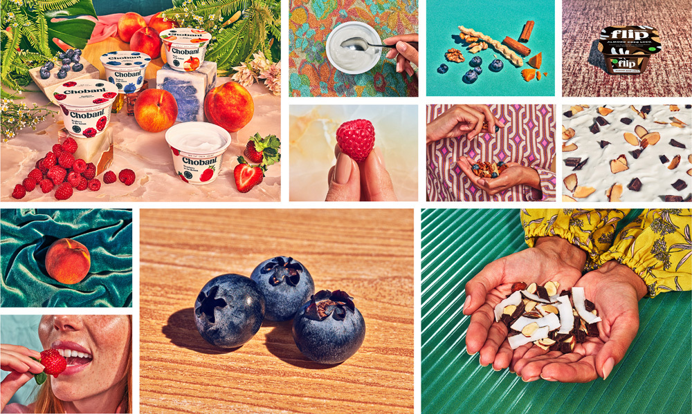
Crissie: Well, everything! Like many people, my introduction to the rebrand was the actual, physical yogurt containers on my refrigerator shelf. It felt like such a throwback. I like that Chobani has gotten away from the old, sleek, modern look that to me, never felt quite right for what was inside.
The new font is so chunky, smooth and round. I also love that they shifted to a more natural, off-white color, use illustrated fruit and softened the color of the logo.
Because I liked it so much, I started trying to figure out which agency had done the creative for them. I discovered several blogs that included the full brand roll-out. That’s when I fell. In. Love. It’s freaking brilliant. There is so much grit and honesty in the brand. It has an old-school beauty with a really unique color palette, and I’m a sucker for unconventional color.
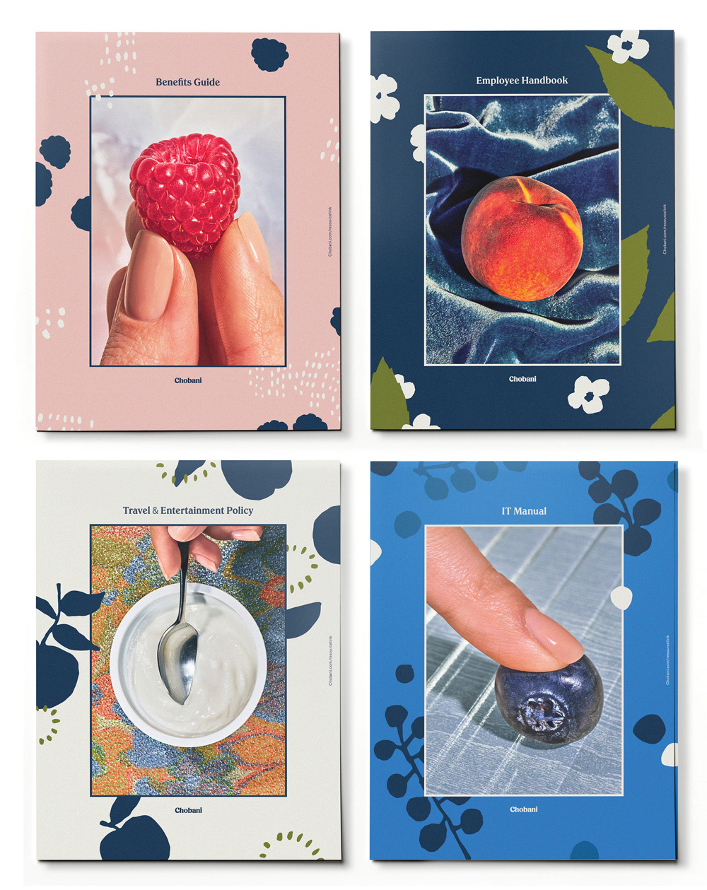
I love the photography treatment and illustration. I love how the containers are all different but there’s still a cohesive brand story. Even the employee manuals are incredible. They remind me of that old show, Bewitched. The tension of that blueberry on the IT manual almost popping…you can feel it!
This was a very bold reinvention that could not bring me more joy. I am on the verge of being Chobani’s redesign creepy fan girl. And I’m totally ok with that.
Crissie: I read that Chobani’s Chief Marketing and Commercial Officer, Peter McGuinness, determined that they had no choice but to rebrand. All of their competitors were starting to look too much like them, and I couldn’t agree more. There was little differentiation on the shelves anymore in the yogurt aisle. Everything was looking too stark and modern on the shelves. Lots of white cups with pretty pictures of fruit. How was a consumer to choose? McGuinness told AdWeek that he expects this redesign to position them as the yogurt giant for the next decade. I bet we’ll see other yogurt companies try to update themselves visually in order to keep up.
Crissie: It needs to be appealing. It needs to feel fresh. Color and imagery play a huge role in letting customers know what’s inside (literally and metaphorically). Knowing which companies your brand is sharing shelf space with is also important in order to set your brand apart. I also believe bravery in design will make you unique. Being safe leads to blending in with your fellow shelf-mates. Stand out. Be bold. Be honest.
Crissie: Are you bored with your brand? Is it too safe? Stale? Expected? Are you just one of many in a shelf lineup? Then it’s time.
Crissie: I think a lot of the principles will stay the same. I think Chobani considered that shift, which still doesn’t represent the vast majority of customers, because the new brand really stands out online too. Take Flip – that bold dark color really pops against competitors.

Crissie: Before this redesign, I loved their yogurt, and I knew that the second biggest location is in Twin Falls, Idaho, just a short drive from us here in Boise. But mostly, it was just the yogurt. To me it is the creamiest, tastiest yogurt, so that made me a brand loyalist. I never gave much thought to the packaging prior to the redesign. I just loved the product.
But this redesign has made me completely re-evaluate who Chobani is as a company. The new look is totally bold and brilliant, and I love that they did it in-house. Major props to them. It appears to me that they took the old playbook and threw it out the window, which takes a lot of guts. That says a lot about their team, that such a bold idea could be trusted by the higher-ups every step of the way in a climate where corporate C-suites can be hyper-concerned about A/B testing.
Mainstream food brands tend to feel the same, very polished and clean. Sure you can find some unique branding on the shelves of Whole Foods, but it’s often a stretch to find something like this in the aisles of your local grocer. Slow clap, Chobani. Slow clap.
Crissie: Well, I do have a serious passion for packaging, and it was actually the focus of my thesis in college. I narrowed my focus to beer packaging, and some of my favorite clients over the years have been food and beverage related, from Simplot, to wine labels, to Powderhaus, a Boise craft brewery, to even tackling a vodka brand’s packaging that was supposedly distilled according to the Russian tsar’s family recipe.