Getting Up to Speed on Responsive Web Design and Mobile-Friendly
BLOG
BLOG

You’ve long known that your website should be mobile-friendly, but for one reason or another haven’t gotten around to making this happen even though your customers have to slog through a nasty user experience.
For some reason or another—perhaps a lack of data analytics—you don’t care as much about the mobile experience because you lack insights into the lost leads or sales opportunities it creates.
Or maybe you’re more focused on SEO. Perhaps a recent move by Google that will affect your SEO will change your perspective on making this investment.
Google recently announced that a site's mobile readiness will now factor into search results. Users performing a search on a mobile device will see a “mobile-friendly” mark in results. Google is also “experimenting with using the mobile-friendly criteria as a ranking signal.”1 That’s a big hammer. The Google gate will drop, and you’ll show up lower on search rankings—so customers may not even be able to find your crappy mobile experience.
So now that you feel guilty for reading this blog on your phone, let’s talk about how you are reading it.
In the past, websites were built to accommodate the “average users” screen size. This goes back to the day when a width of 720 pixels was the norm and anyone viewing on a wider screen would see lovely blank space or some crafty pattern on the sides. Fluid design started to change the game with its ability to inspect the elements of the user’s device and adjust the page to fill the screen or browser window.

Then came the use of completely separate “mobile-friendly” sites. This meant twice the work and twice the budget for web designers and only scratched the surface of what needed to be done for the dizzying array of devices and screen sizes.
This is where “responsive web design” comes into play. If you are new to this buzzword, responsive web design uses flexible or fluid grids, fluid images and media queries to adapt to the user’s different devices and viewports. Responsive web design creates a unique user experience based on the device used, rather than simply adjusting the size of the web page. It takes into account that the user’s device may be a cutting edge, state-of-the-art high-definition smart phone, tablet, or a large cinema display. On any device it allows websites to come across equally impressive and accessible.
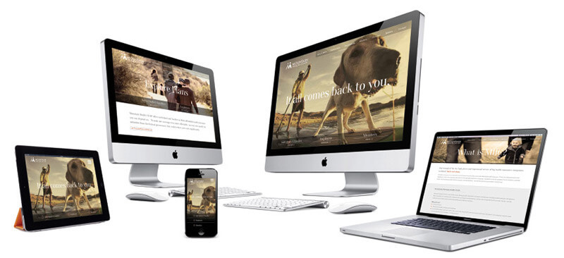
We got in early and have been working on responsive web design for more than four years. In fact, our work has been honored by a number of web design blogs, including recognition in 2012 as one of the 20 best responsive web designs that year (from a prior version of our current site) to inclusion for our current site on this year’s Showcase of Best Responsive Websites from responsive css.
Responsive web design makes it easy to fulfill user needs. Users today have high expectations for the content they are viewing on their device. Responsive web design helps meet these high expectations and keep users engaged. First and foremost, it makes it easy for the user to fulfill their desired tasks. When a user comes to your site, they are hoping to carry out a quick check of your webpage for a specific purpose. A mobile user’s attention span is much shorter than that of a PC user, especially if they are on the go or using up precious data. Responsive web design optimizes your pages and navigation for ease of use and lets users complete their tasks quickly before they abandon your site.
Speed is king. If your site is slow to load most users will give up quickly and jump over to a competitors site. With today’s variations in cell coverage, speed, and Wi-Fi connections, you can never be sure that each user has full access to broadband speed—so a fast loading page is a MUST. Responsive web design uses fluid images and layouts to allow exactly what is needed on the page to carry out a particular task without compromising image quality.
Less is more. Progressive disclosure is a design technique that helps maintain a user’s attention by reducing clutter and confusion. Basically only presenting the minimum data required to compete a task. Some devices offer very limited space to provide your company information, navigation and action zones, so everything needs to be as concise as possible. Websites viewed on mobile devices can’t waste valuable real estate with clutter that makes action zones smaller and reduces usability.
Here is a simple question for you. Do you know where your cell phone is?
Of course you do. If it is not in your hand as you’re reading this, it’s somewhere close, definitely within arms reach, calling out for you to check email, catch up on some social media, or surf the web. A recent study found the average user is on their phone/tablet almost three hours a day (two hours and forty-two minutes to be exact).2 That breaks down to 19 hours a week, three days a month, or a whopping 41 days a year. And that is just the average U.S user. Let’s not even get into the craziness of college-aged females clocking in at an average 10 hours a day, with male students not far behind at 8 hours.3 If you’re involved with Millennial marketing, you need to use responsive web design.
According to marketland.com4 only 11.8% of websites are actually responsive, which amounts to a special brand of business craziness that rivals the mobile craziness of college-aged females. Would you rather your competition inform, entertain, and sell to your customers simply because they’re mobile-friendly? It’s really a business I.Q. test of sorts.
You can see if your site is deemed “mobile-friendly” here. If you have questions or need help becoming mobile-friendly and developing a responsive website, let’s talk.
1 - http://googlewebmastercentral.blogspot.com/2014/11/helping-users-find-mobile-friendly-pages.html
2 -http://www.businessinsider.com/iphone-ipad-samsung-mobile-usage-stats-2014-7
4- http://marketingland.com/82-sites-use-responsive-web-design-2015-try-11-8-114050
Blog
Use CSR data to your advantage - Don't let consumers' imaginations work against you.
Blog
Stop cramming important stuff above the fold. It's poor user experience and looks bad.
Blog
Do yourself a favor and be a CMS contrarian.